
In this article I will discuss why you need responsive web design for your website, and it’s features and advantages over other types of web design.
A responsive web design, also referred to as mobile responsive design, is the term used for website design in which each single web page adjusts the width and responses according to the device it is being viewed on without messing up the text size, layout and media contents to provide the users similar experience from every device.
Responsive web design is achieved with a combined use of HTML, CSS, JavaScript, JQuery etc.
Earlier, websites were built for only desktops or laptops. The variety in screen sizes were limited to a few different sizes, and static HTML website served the purposes for most viewers. But, with the wide adoption of smartphones and tablets, the number of mobile users has increased rapidly and is still on the rise.
The static desktop sites that used to be sufficient are not user friendly anymore, as the large site is crammed into a small screen. The page contents can hardly be seen let alone read or used for other information.
Several solutions have been used to overcome these drawbacks. Two of the most popular solutions to this problem are Device Detection and Responsive Web Design.
In the device detection method, two versions of a website were built- one for desktop and one for mobile devices. When a user sent a request from a browser, the website server processed some code to detect the device used to send the request and respond with either the mobile or desktop version.
However, in the case of responsive web design, a website is built with the combination of static html language, formatting language CSS, script language JavaScript, and JavaScript library like JQuery etc. The whole purpose is to create a fluid and flexible layout and user-friendly interface so that users can easily view the content and navigate through the website without horizontal scrolling. Ethan Marcotte, founder of modern responsive web design, defined RWD (Source: Responsive Web Design) as the combination of these three elements-
- Fluid Grid: For sizing page elements in relative scaling like percentage rather than pixels or points.
- Flexible Images: For sizing images in relative scaling.
- Media Queries: Different CSS for different devices.
Why is Responsive Web Design So Important?
Responsive Web Design has a lot of advantages over other mobile ready solutions. Here are some crucial facts for you to determine if you need responsive web design:
- User Friendly Interface: The whole purpose of a website is to get in touch with a target audience. A responsive web design ensures suitable grid alignments and layouts irrespective of devices. Even if the users switch devices they experience similar content. Besides, user behavior is a huge factor for online growth in the Machine Learning era of search engines. If a website or part of that website is not responsive, there will be a high bounce rate and poor performance on SERPs.
- SEO Friendly: After the Mobile First algorithm update, responsive web design has more importance than ever. Although Google directly does not account mobile responsiveness as a ranking signal, but a responsive website will perform better for mobile users. [Source: Mobile First Indexing]
Moreover, page speed is a huge factor for ranking mobile websites. [Source: Speed Update]. The dynamic features of Responsive Web Design resizes images to reduce the page size and ultimately the page speed. From an SEO perspective, a slow page load time can be catastrophic for small business. - Cost Effective: Building a responsive website costs much less than having a separate mobile version. Here, you need to pay the developer for only one version. A single investment that will serve your multiple purposes. Besides, the budget needed for hosting and maintenance are also far less for one responsive site than for a separate desktop and mobile site.
- Easy to Maintain: A single website is far easier to maintain than multiple versions of a website. When posting or updating new information, you do not have to worry about updating multiple places. Besides, tracking user data brings a whole lot of confusion in cases where you are tracking multiple version The pages are connected through canonical tags, therefore, analyzing the analytics data becomes a stressful burden.
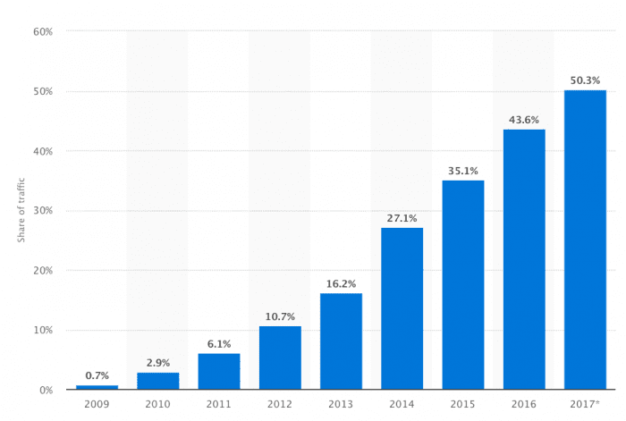
Major Portion of Search Traffic from Mobile: Today, the majority of searches are performed on mobile devices. From just 0.7 percent in 2009 to 50.3 percent in 2017 of all website traffic around the world comes from mobile devices. [Source: Smart Insight]

[Image Source: https://www.smartinsights.com/wp-content/uploads/2018/01/Percentage-of-all-global-web-pages-served-to-mobile-phones-2009-2017-700×471.png]
- A Design for Future: Responsive Web design relieves you of worrying about newer versions of products. In responsive design, the dynamic scaling system can adjust your website grid, layout and content for any device that currently exists or those that will be launched in the future.
A responsive web design can be the difference between the success and failure of you website. Make your website perform better across all devices and all browsers through responsive web design.

